本节代码对应 GitHub 分支: chapter8
# 迷你版布局
首先在 Player 目录下新建 miniPlayer 子目录,
//miniPlayer/index.js
import React from 'react';
import {getName} from '../../../api/utils';
import { MiniPlayerContainer } from './style';
function MiniPlayer (props) {
const { song } = props;
return (
<MiniPlayerContainer>
<div className="icon">
<div className="imgWrapper">
<img className="play" src={song.al.picUrl} width="40" height="40" alt="img"/>
</div>
</div>
<div className="text">
<h2 className="name">{song.name}</h2>
<p className="desc">{getName (song.ar)}</p>
</div>
<div className="control">
<i className="iconfont"></i>
</div>
<div className="control">
<i className="iconfont"></i>
</div>
</MiniPlayerContainer>
)
}
export default React.memo (MiniPlayer);
样式组件对应如下,在 style.js 中:
import styled, {keyframes} from'styled-components';
import style from '../../../assets/global-style';

const rotate = keyframes`
  0%{
    transform: rotate (0);
  }
  100%{
    transform: rotate (360deg);
  }
`

export const MiniPlayerContainer = styled.div`
  display: flex;
  align-items: center;
  position: fixed;
  left: 0;
  bottom: 0;
  z-index: 1000;
  width: 100%;
  height: 60px;
  background: ${style ["highlight-background-color"]};
  &.mini-enter {
    transform: translate3d (0, 100%, 0);
  }
  &.mini-enter-active {
    transform: translate3d (0, 0, 0);
    transition: all 0.4s;
  }
  &.mini-exit-active {
    transform: translate3d (0, 100%, 0);
    transition: all .4s
  }
  .icon {
    flex: 0 0 40px;
    width: 40px;
    height: 40px;
    padding: 0 10px 0 20px;
    .imgWrapper {
      width: 100%;
      height: 100%;
      img {
        border-radius: 50%;
        &.play {
          animation: ${rotate} 10s infinite;
          &.pause {
            animation-play-state: paused;
          }
        }
      }
    }
  }
  .text {
    display: flex;
    flex-direction: column;
    justify-content: center;
    flex: 1;
    line-height: 20px;
    overflow: hidden;
    .name {
      margin-bottom: 2px;
      font-size: ${style ["font-size-m"]};
      color: ${style ["font-color-desc"]};
      ${style.noWrap ()}
    }
    .desc {
      font-size: ${style ["font-size-s"]};
      color: ${style ["font-color-desc-v2"]};
      ${style.noWrap ()}
    }
  }
  .control {
    flex: 0 0 30px;
    padding: 0 10px;
    .iconfont, .icon-playlist {
      font-size: 30px;
      color: ${style ["theme-color"]};
    }
    .icon-mini {
      font-size: 16px;
      position: absolute;
      left: 8px;
      top: 8px;
      &.icon-play {
        left: 9px
      }
    }
  }
`
当然,在 Player/index.js 下也要做一些修改:
//Player/index.js 修改内容如下
import MiniPlayer from './miniPlayer';

function Player (props) {
  const currentSong = {
    al: { picUrl: "https://p1.music.126.net/JL_id1CFwNJpzgrXwemh4Q==/109951164172892390.jpg" },
    name: "木偶人",
    ar: [{name: "薛之谦"}]
  }
  return (
    <div>
      <MiniPlayer song={currentSong}/>
    </div>
  )
}

//...
现在大家能看到的应该是这个样子了。
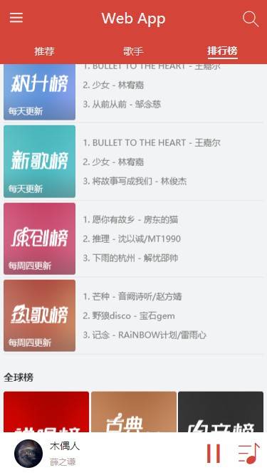
这里暂停按钮比较单调,因为没有包括进度条,这个组件下一节来开发,现在先用图标代替。
miniPlayer 的布局就这些,还算比较简单,我们现在马上过渡到全屏版本的布局中。
# 全屏版布局
给大家整理了一下,现在大致的布局是这样。
//normalPlayer/index.js
import React from "react";
import { getName } from "../../../api/utils";
import {
NormalPlayerContainer,
Top,
Middle,
Bottom,
Operators,
CDWrapper,
} from "./style";
function NormalPlayer (props) {
const {song} = props;
return (
<NormalPlayerContainer>
<div className="background">
<img
src={song.al.picUrl + "?param=300x300"}
width="100%"
height="100%"
alt="歌曲图片"
/>
</div>
<div className="background layer"></div>
<Top className="top">
<div className="back">
<i className="iconfont icon-back"></i>
</div>
<h1 className="title">{song.name}</h1>
<h1 className="subtitle">{getName (song.ar)}</h1>
</Top>
<Middle>
<CDWrapper>
<div className="cd">
<img
className="image play"
src={song.al.picUrl + "?param=400x400"}
alt=""
/>
</div>
</CDWrapper>
</Middle>
<Bottom className="bottom">
<Operators>
<div className="icon i-left" >
<i className="iconfont"></i>
</div>
<div className="icon i-left">
<i className="iconfont"></i>
</div>
<div className="icon i-center">
<i className="iconfont"></i>
</div>
<div className="icon i-right">
<i className="iconfont"></i>
</div>
<div className="icon i-right">
<i className="iconfont"></i>
</div>
</Operators>
</Bottom>
</NormalPlayerContainer>
);
}
export default React.memo (NormalPlayer);
相应的 style.js 如下:
import styled, { keyframes } from "styled-components";
import style from "../../../assets/global-style";

const rotate = keyframes`
  0%{
    transform: rotate (0);
  }
  100%{
    transform: rotate (360deg);
  }
`;
export const NormalPlayerContainer = styled.div`
  position: fixed;
  left: 0;
  right: 0;
  top: 0;
  bottom: 0;
  z-index: 150;
  background: ${style ["background-color"]};
  .background {
    position: absolute;
    left: 0;
    top: 0;
    width: 100%;
    height: 100%;
    z-index: -1;
    opacity: 0.6;
    filter: blur (20px);
    &.layer {
      background: ${style ["font-color-desc"]};
      opacity: 0.3;
      filter: none;
    }
  }
`;
export const Top = styled.div`
  position: relative;
  margin-bottom: 25px;
  .back {
    position: absolute;
    top: 0;
    left: 6px;
    z-index: 50;
    .iconfont {
      display: block;
      padding: 9px;
      font-size: 24px;
      color: ${style ["font-color-desc"]};
      font-weight: bold;
      transform: rotate (90deg);
    }
  }
  .title {
    width: 70%;
    margin: 0 auto;
    line-height: 40px;
    text-align: center;
    font-size: ${style ["font-size-l"]};
    color: ${style ["font-color-desc"]};
    ${style.noWrap ()};
  }
  .subtitle {
    line-height: 20px;
    text-align: center;
    font-size: ${style ["font-size-m"]};
    color: ${style ["font-color-desc-v2"]};
    ${style.noWrap ()};
  }
`;
export const Middle = styled.div`
  position: fixed;
  width: 100%;
  top: 80px;
  bottom: 170px;
  white-space: nowrap;
  font-size: 0;
  overflow: hidden;
`;
export const CDWrapper = styled.div`
  position: absolute;
  margin: auto;
  top: 10%;
  left: 0;
  right: 0;
  width: 80%;
  box-sizing: border-box;
  height: 80vw;
  .cd {
    width: 100%;
    height: 100%;
    border-radius: 50%;
    .image {
      position: absolute;
      left: 0;
      top: 0;
      width: 100%;
      height: 100%;
      box-sizing: border-box;
      border-radius: 50%;
      border: 10px solid rgba (255, 255, 255, 0.1);
    }
    .play {
      animation: ${rotate} 20s linear infinite;
      &.pause {
        animation-play-state: paused;
      }
    }
  }
  .playing_lyric {
    margin-top: 20px;
    font-size: 14px;
    line-height: 20px;
    white-space: normal;
    text-align: center;
    color: rgba (255, 255, 255, 0.5);
  }
`;

export const Bottom = styled.div`
  position: absolute;
  bottom: 50px;
  width: 100%;
`;
export const ProgressWrapper = styled.div`
  display: flex;
  align-items: center;
  width: 80%;
  margin: 0px auto;
  padding: 10px 0;
  .time {
    color: ${style ["font-color-desc"]};
    font-size: ${style ["font-size-s"]};
    flex: 0 0 30px;
    line-height: 30px;
    width: 30px;
    &.time-l {
      text-align: left;
    }
    &.time-r {
      text-align: right;
    }
  }
  .progress-bar-wrapper {
    flex: 1;
  }
`;
export const Operators = styled.div`
  display: flex;
  align-items: center;
  .icon {
    font-weight: 300;
    flex: 1;
    color: ${style ["font-color-desc"]};
    &.disable {
      color: ${style ["theme-color-shadow"]};
    }
    i {
      font-weight: 300;
      font-size: 30px;
    }
  }
  .i-left {
    text-align: right;
  }
  .i-center {
    padding: 0 20px;
    text-align: center;
    i {
      font-size: 40px;
    }
  }
  .i-right {
    text-align: left;
  }
  .icon-favorite {
    color: ${style ["theme-color"]};
  }
`;
现在大家可以看到基本的布局啦。如下图,并且唱片部分正在旋转:
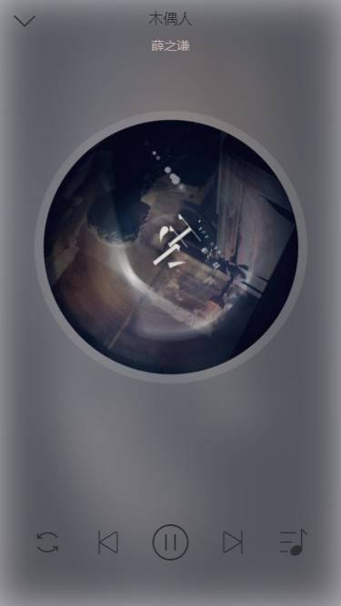
其实这部分的布局相对之前的几个组件还是相当简单的,不做赘述了,我们把重心放在后面更出彩的部分 ———— 进出场动画。
# 全屏版进场动画
# 引入状态
既然是要进场,那就必须涉及到状态的改变了,具体来说我们现在需要拿出 redux 中的 fullScreen 并做相应的改变。
由于父组件连接了 redux,现在 normalPlayer 只需从父组件接受相应的变量和方法即可。
首先在父组件中传 props:
function Player (props) {
  const { fullScreen } = props;

  const { toggleFullScreenDispatch } = props;

  //...
  return (
    <div>
      <MiniPlayer
        song={currentSong}
        fullScreen={fullScreen}
        toggleFullScreen={toggleFullScreenDispatch}
      />
      <NormalPlayer
        song={currentSong}
        fullScreen={fullScreen}
        toggleFullScreen={toggleFullScreenDispatch}
      />
    </div>
  )
}
然后在 normalPlayer 中接收。
const { song, fullScreen } =  props;
const { toggleFullScreenDispatch } = props;

return (
  <CSSTransition
    classNames="normal"
    in={fullScreen}
    timeout={400}
    mountOnEnter
    //onEnter={enter}
    //onEntered={afterEnter}
    //onExit={leave}
    //onExited={afterLeave}
  >
  // 组件代码
  </CSSTransition>
)
当然,这里的钩子函数还没有定义。因为还有一些准备工作需要提前做一下。
# 准备工作
首先 miniPlayer 里面,当 fullScreen 为 false 的时候应该不显示,我们也可以运用一下 CSSTransition:
// 引入 useRef

const miniPlayerRef = useRef ();

return (
  <CSSTransition
    in={!fullScreen}
    timeout={400}
    classNames="mini"
    onEnter={() => {
      miniPlayerRef.current.style.display = "flex";
    }}
    onExited={() => {
      miniPlayerRef.current.style.display = "none";
    }}
  >
    <MiniPlayerContainer ref={miniPlayerRef} onClick={() => toggleFullScreen (true)}>
      // 其余代码不变
    </MiniPlayerContainer>
  </CSSTransition>
)
关于 mini 动画钩子类在 style.js 中如下声明:
//NormalPlayerContainer 组件下
&.mini-enter {
  transform: translate3d (0, 100%, 0);
}
&.mini-enter-active {
  transform: translate3d (0, 0, 0);
  transition: all 0.4s;
}
&.mini-exit-active {
  transform: translate3d (0, 100%, 0);
  transition: all .4s
}
这样实现了 miniPlayer 进出的过渡效果。
接下来需要用到 JS 的帧动画插件 create-keyframe-animation
npm install create-keyframe-animation --save
# JS 实现帧动画
接下来高能预警!
先拿到一些关键元素的 DOM 对象。
const normalPlayerRef = useRef ();
const cdWrapperRef = useRef ();
分别对应:
<NormalPlayerContainer ref={normalPlayerRef}>
//...
  <Middle ref={cdWrapperRef}>
现在,来开始着手写动画钩子的逻辑。
// 引入的代码
import animations from "create-keyframe-animation";

// 启用帧动画
const enter = () => {
  normalPlayerRef.current.style.display = "block";
  const { x, y, scale } = _getPosAndScale ();// 获取 miniPlayer 图片中心相对 normalPlayer 唱片中心的偏移
  let animation = {
    0: {
      transform: `translate3d (${x} px,${y} px,0) scale (${scale})`
    },
    60: {
      transform: `translate3d (0, 0, 0) scale (1.1)`
    },
    100: {
      transform: `translate3d (0, 0, 0) scale (1)`
    }
  };
  animations.registerAnimation ({
    name: "move",
    animation,
    presets: {
      duration: 400,
      easing: "linear"
    }
  });
  animations.runAnimation (cdWrapperRef.current, "move");
};

// 计算偏移的辅助函数
const _getPosAndScale = () => {
  const targetWidth = 40;
  const paddingLeft = 40;
  const paddingBottom = 30;
  const paddingTop = 80;
  const width = window.innerWidth * 0.8;
  const scale = targetWidth /width;
  // 两个圆心的横坐标距离和纵坐标距离
  const x = -(window.innerWidth/ 2 - paddingLeft);
  const y = window.innerHeight - paddingTop - width / 2 - paddingBottom;
  return {
    x,
    y,
    scale
  };
};
const afterEnter = () => {
  // 进入后解绑帧动画
  const cdWrapperDom = cdWrapperRef.current;
  animations.unregisterAnimation ("move");
  cdWrapperDom.style.animation = "";
};
现在可以看到这样的进场效果。
但是,这还不够!
我们可以让 Top 和 Bottom 都跟着动起来。
还记得刚刚写过的 "normal" 的钩子类吗?我们利用贝塞尔动画曲线给它们一个过渡。
//normalPlayer/style.js
//NormalPlayerContainer 样式组件下
&.normal-enter,
&.normal-exit-done {
  .top {
    transform: translate3d (0, -100px, 0);
  }
  .bottom {
    transform: translate3d (0, 100px, 0);
  }
}
&.normal-enter-active,
&.normal-exit-active {
  .top,
  .bottom {
    transform: translate3d (0, 0, 0);
    transition: all 0.4s cubic-bezier (0.86, 0.18, 0.82, 1.32);
  }
  opacity: 1;
  transition: all 0.4s;
}
&.normal-exit-active {
  opacity: 0;
}
仔细观察,Top 和 Bottom 部分出现的相应的过渡,可以发现现在的效果较之前是更加灵动的:
# 出场动画
首先声明一下,我们实现的出场动画是基于 transform 属性的,但是 transform 在不同的浏览器厂商会有不同的前缀,这个问题在 CSS 中可以用 postcss 等工具来解决,但是 JS 中我们现在只有自己来处理了。
在 api/utils.js 中添加:
// 给 css3 相关属性增加浏览器前缀,处理浏览器兼容性问题
let elementStyle = document.createElement ("div").style;

let vendor = (() => {
  // 首先通过 transition 属性判断是何种浏览器
  let transformNames = {
    webkit: "webkitTransform",
    Moz: "MozTransform",
    O: "OTransfrom",
    ms: "msTransform",
    standard: "Transform"
  };
  for (let key in transformNames) {
    if (elementStyle [transformNames [key]] !== undefined) {
      return key;
    }
  }
  return false;
})();

export function prefixStyle (style) {
  if (vendor === false) {
    return false;
  }
  if (vendor === "standard") {
    return style;
  }
  return vendor + style.charAt (0).toUpperCase () + style.substr (1);
}
然后在 normalPlayer/index.js 中引入 prefixStyle 方法。
import { prefixStyle } from "../../../api/utils";

// 组件代码中加入
const transform = prefixStyle ("transform");
接下来写离开动画的逻辑:
const leave = () => {
  if (!cdWrapperRef.current) return;
  const cdWrapperDom = cdWrapperRef.current;
  cdWrapperDom.style.transition = "all 0.4s";
  const { x, y, scale } = _getPosAndScale ();
  cdWrapperDom.style [transform] = `translate3d (${x} px, ${y} px, 0) scale (${scale})`;
};

const afterLeave = () => {
  if (!cdWrapperRef.current) return;
  const cdWrapperDom = cdWrapperRef.current;
  cdWrapperDom.style.transition = "";
  cdWrapperDom.style [transform] = "";
  // 一定要注意现在要把 normalPlayer 这个 DOM 给隐藏掉,因为 CSSTransition 的工作只是把动画执行一遍
  // 不置为 none 现在全屏播放器页面还是存在
  normalPlayerRef.current.style.display = "none";
};

OK, 至此我们的进场和出场动画就开发完成了!是不是 get 到很多新姿势呢:)


